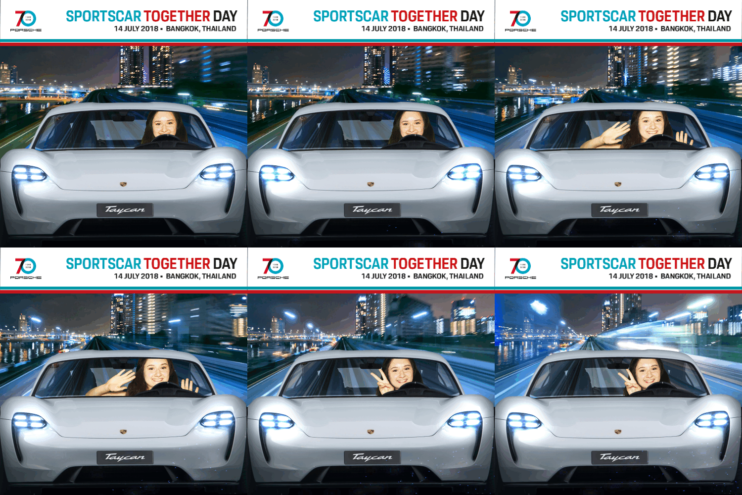
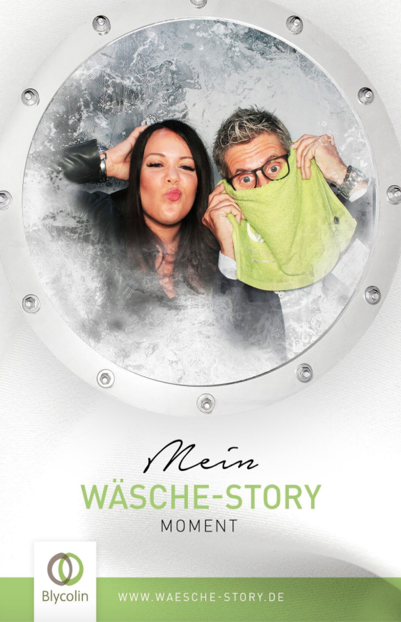
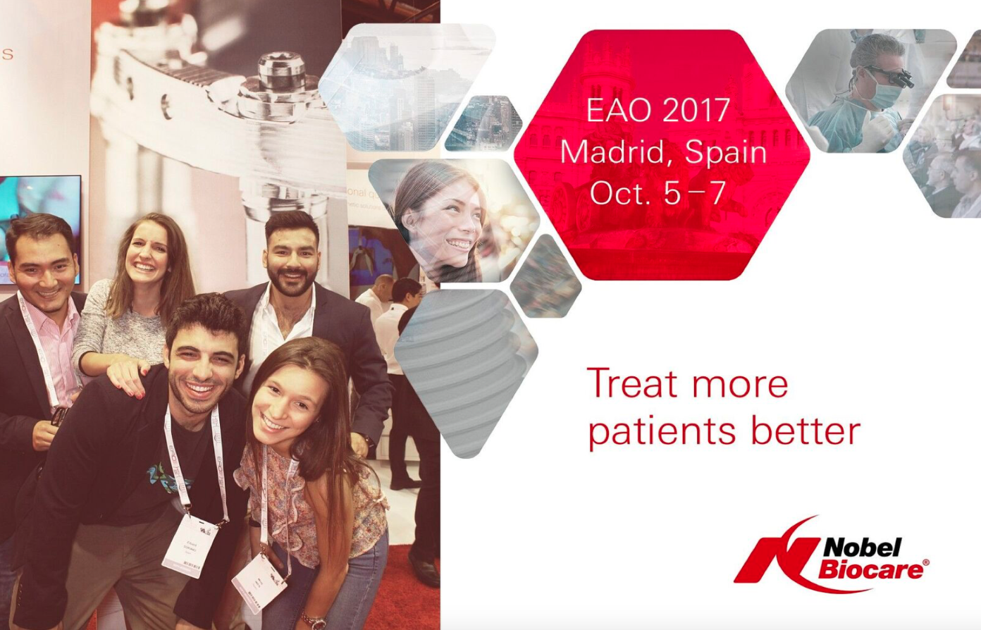
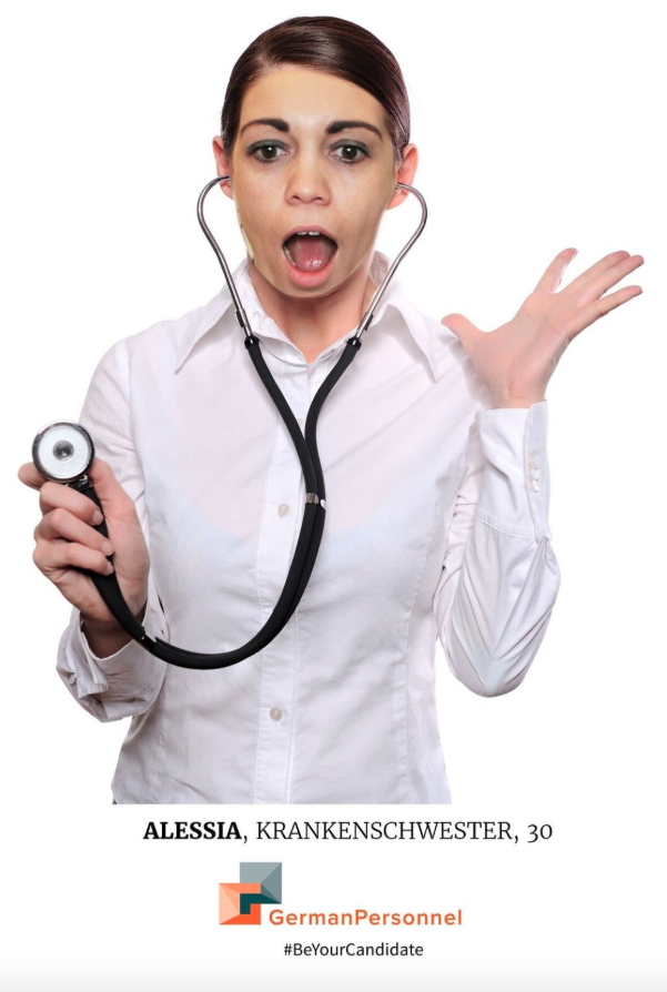
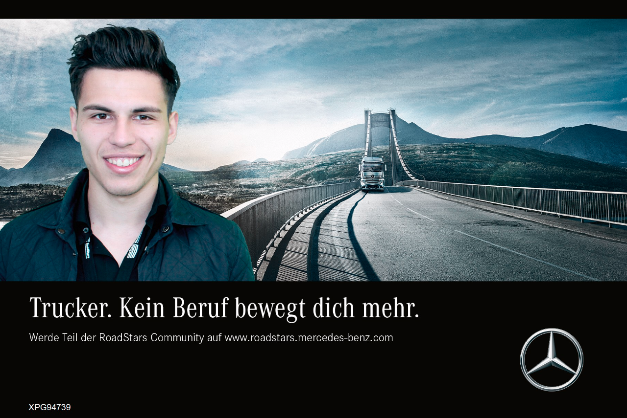
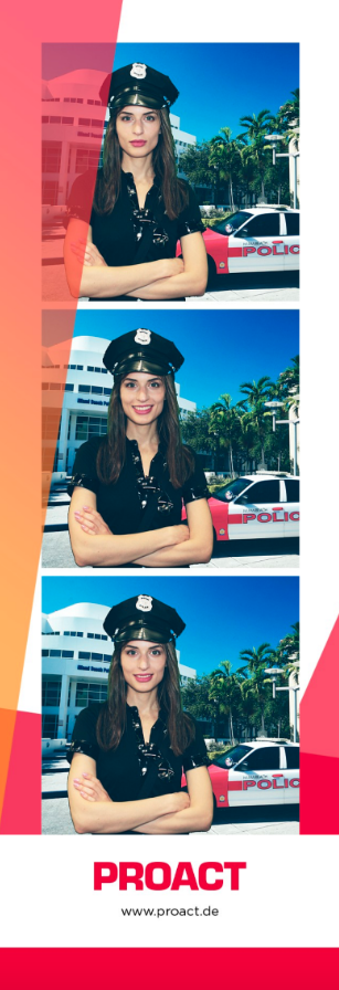
4./5./6. Photo/GIF/Boomerang
Contents
Examples
Available Options
The options for all Capture Modes are quite similar. There are only few differences which are highlighted below. The letters in parentheses mark the availability of each option for the Capture Modes Photo (P), GIF (G) and Boomerang (B).
Option | Screenshot |
|---|---|
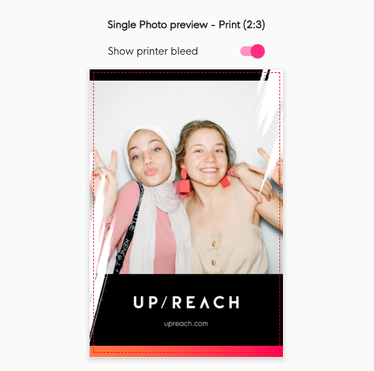
Preview & printer bleedThe area on the right side is a live preview of your current settings, including example photo booth images. For the print layout you can enable/disable the printer bleed preview (red dashed frame around the layout). The printer bleed has to be taken into account when creating your print layout designs. It is required for borderless printing, i.e. the printer will print “over the borders”, which is the bleed area. Thus, your design should entirely fill the bleed area to make sure the printout looks good. | |
Countdown time (P/G/B)Here you can choose your desired countdown time. The countdown starts after the user taps the capture button on the Experience Screen | Live View & Effects. For each photo/video taken, there is one countdown - i.e. for GIF with 3 photos, there are 3 countdowns in total (one for each photo). | |
Capture time (Boomerang only)This is the recording time for the Boomerang video. It always plays back and forth, meaning that a 1,5s video will result in a 3s Boomerang (depending on your playback speed options, see below). | |
Photo aspect ratio (P/G/B)This defines the aspect ratio of the photo/video, thus also of the live view (see Experience Screen | Live View & Effects). The images within the print & digital layouts will adapt to this aspect ratio. This does not change the layout size & aspect ratio though. You can either choose one of the predefined ratios or enter a custom ratio. | |
Allow printing (P/G/B)This toggle allows you to enable or disable printing for each capture mode. Deactivating it will disable the print layout and remove the print button from the Sharing Screen | Printing & Sharing. | |
Allow sharing of print file (P/G/B)By default users will receive both the print and sharing files. This toggle allows you to disable sharing for the print layout file which will make it used only for printing. | |
Print layout aspect ratio (P/G/B)As we have to follow our default printer paper size (10x15cm) you cannot freely define the print layout size - but you can choose the orientation of the printout (Portrait or Landscape). Portrait: 2:3, 10x15cm, printed area 1200x1800px, layout size 1240x1844px | |
Photo strips (P/G/B)Enabling this toggle activates the printer’s 2-inch cutting which will cut the printout longwise, resulting in two 5x15cm photo strips. This also allows you to add each image to the layout twice, e.g. for creating two identical photo strips. | |
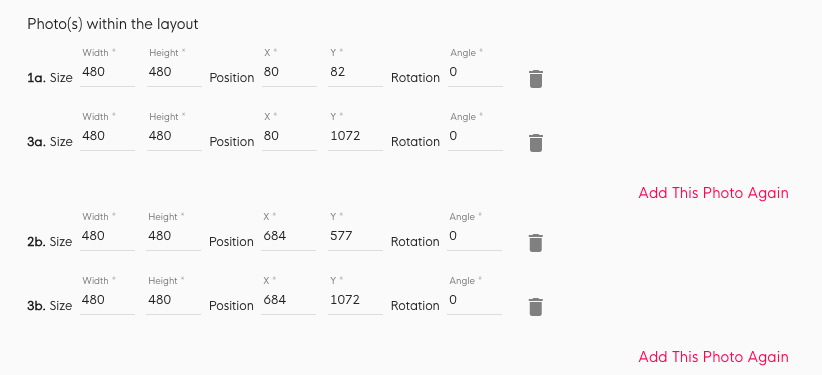
Photos within the print layout (P/G/B)Here you can define the size (pixel), position (pixel) and rotation (degree) of each image within the layout. | |
Add more images to the print layout (P/G/B)Use this button to add another image to the layout. You can add each image once (twice with activated photo strips, see above). A layout must contain at least 1 image. Click on the trash icon to remove an image from the layout. Available images per Capture Mode: | |
Simple print layout: use design from start screen (P/G/B)Enabling this toggle will simply use your Start Screen design for this layout (Start Screen logo & Background color/image). This also disables the upload buttons for an advanced layout design. | |
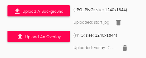
Custom print layout: upload your own designs (P/G/B)Use these buttons to upload your custom designs as a layout background or overlay. Uploaded files will show up next to the buttons and can be deleted via the trash icon or simply overwritten by uploading a new design.
Layout size: 1844x1240px or 1240x1844px, depending on your selected print layout aspect ratio (see above). Make sure your uploaded designs match these dimensions. | |
Allow sharing of print file (P/G/B)This toggle allows you to enable or disable the digital sharing layout for each capture mode. Deactivating it will disable the sharing layout and remove it from the Sharing Screen | Printing & Sharing. If print layout sharing is disabled, too, users will not be able to share their photo/video digitally. | |
Digital sharing layout aspect ratio (P/G/B)For the digital sharing layout you can freely choose any aspect ratio. We recommend using one of the following ratios to optimize the output for social media:
| |
Digital sharing layout size (P/G/B)For the digital sharing layout you can even define its size. Simply enter the desired dimensions in pixels. The value of the other field will automatically change based on your chosen aspect ratio (see above). Larger dimensions = larger file size = longer in-app processing time! The default size is 500x500px as this keeps the processing times short and file sizes small. Email sending with photos attached will take longer for larger file sizes. | |
Photo dimensions & position within the layoutHere you can define the size (pixel), position (pixel) and rotation (degree) of the photos/video within the digital sharing layout. These values are applied to all images. | |
Simple digital sharing layout: use design from start screen (P/G/B)Enabling this toggle will simply use your Start Screen design for this layout (Start Screen logo & Background color/image). This also disables the upload buttons for an advanced layout design. | |
Live view overlays & backgrounds (P/G/B)This option will include your overlay & background designs in the Experience Screen | Live View & Effects and Capturing | Countdown & Thumbnails already. Use this feature in combination with Chroma Keying (see 2. Start Screen & general settings) or Face Overlays (see Examples at the beginning of this article https://upreach.atlassian.net/wiki/spaces/UHC/pages/76087354/3.+4.+5.+Photo+GIF+Boomerang#Examples) for an immersive user experience . | |
Mirror live view overlays & backgrounds (P/G/B)Enable this if your overlay or background designs include elements which could potentially cover a user’s face or the user should interact with. Your designs will be mirrored in the live view, but not in the final output. Disable it, if your design just contains some logo or patterns that are not relevant to user position & interaction. The camera live view is mirrored so users can naturally interact and move in front of the screen (which works like a mirror). The photos/videos will not be mirrored in the final output anymore. | |
Custom digital sharing layout: upload your own designs (P/G/B)Use these buttons to upload your custom designs as a layout background or overlay. Uploaded files will show up next to the buttons and can be deleted via the trash icon or simply overwritten by uploading a new design.
Layout size depends on your selected digital layout size (see above). Make sure your uploaded designs match these dimensions. Animated overlays & backgrounds You can upload multiple frames to create an animated layout design. Upload one frame after another or all at once (in the latter case they will be sorted alphabetically by file name). The uploaded frames will be evenly distributed over the entire video, based on the defined playback time/speed (see below). For the mode Single Photo this will make the animation time/speed option appear below. | |
Playback time/speed (P/G/B)This slider determines the final speed and length of the digital output files and thus also affects the final file size. The longer the video is, the larger the file will become (but also depending on the number of photo/video/overlay/background frames). For the mode Single Photo, this slider will only appear after uploading at least 2 overlays or backgrounds (see above). The animation/video will be repeated 5x in the final file (with max. 5s time in total for the repetitions). Longer time = larger file size = longer in-app processing time! The default time is 1,5s as this keeps the processing times short and file sizes small. Email sending with photos/videos attached will take longer for larger file sizes. |
